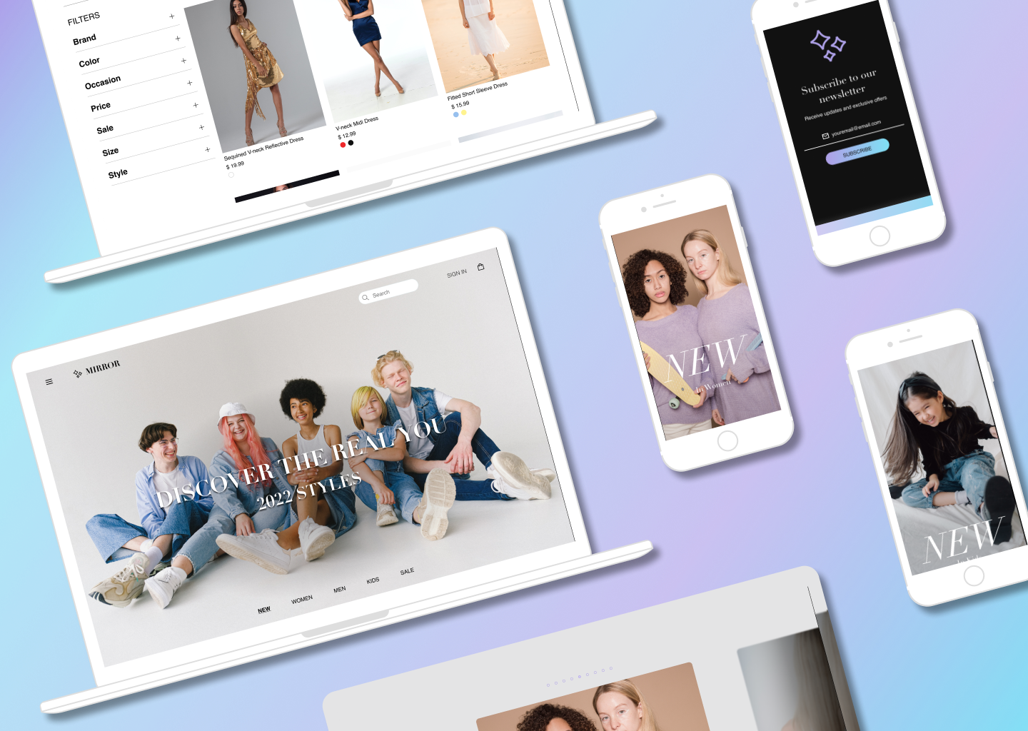
Mirror
Student Project
Designing a responsive website for a clothing store that wants to take their business online since currently they only have a very outdated information website.
Project details
1 month duration
Role: User Research, UX/UI design
Tools: Figma, Procreate, Miro
Outcome: Logo, Icons, Website design
Introduction
Mirror’s main goal is to sell their products for different people and styles. The clothing company expects decent filters and a good size selection.

Research
Competitive analysis was researched to compare similar businesses, personas were made to understand needs and stresses, and interviews were conducted to gain perspectives on feature preferences for the website.
Provisional Personas were used for shopper demographic at Mirror and comparable brands that would help guide the design of the website.
Questions asked during the interviews focused on habits and common issues they come across when shopping online for clothing .
People tend to use the search box more often than the navigation bar. This could imply people want to find specific items online instead of browsing for too long.
Common issues were finding the right sizing and measurements.
Interview Insights
“The search box is always used because I always know what I'm looking for when I shop online.”
“It’s hard to find the right size measurements like the bust and waist area.”
Foundations
A persona based on the research insights include goals, frustrations, and motivations to understand customer needs and as a guide for my final designs.
A sitemap was created to help make navigation on the site easier and creating a simple navigation bar experience for users.
Wireframes
Low fidelity wireframe sketches focused on prioritizing the search bar but also providing easy navigation for users. I provided two sketches of the homepage having an overlay feature to expand the platform accessibility..
Mid fidelity wireframes were made through Figma of the desktop and mobile to further visualize the final design.
Design
A logo was made with procreate that is modern but also playful. The brand’s primary color I chose is also included in the logo.
A User Interface kit was used as a guide for the website to set the design direction for how the website will overall look like.
Usability Testing
During the usability testing, users struggled with navigating the menu overlay feature on the homepage of Mirror. One participant expressed that there were too many words in the category, making it hard to read and discern certain sections. To resolve this issue, some icons were created to create a visual display for the different categories to make it a smoother navigation process.
Vectored icons were made using Figma to help users visually distinguish the clothing categories provided in the navigation bar when searching for different clothing types making navigation faster and easier.
Prototype
This prototype was created based on the usability testing results and features the use of the navigation bar and then adding an item to the shopping bag and successfully checking out to purchase.
Next Steps…
Iterations I would make for this project are to improve navigation by removing navigation features and adding familiar design, add a review section to the product page and extra filters for specificity, and create more prototype functions to test navigation and possibilities in task flows.


